First Plate - Lines (Dominant: zigzag and diagonal)
It's a bit dark because our camera is gay, but oh well. I like this one because of the border. The girl over the pointy diamond thing is really dramatic, so I kind of don't like that. But I guess it's okay. The shading in the crystals is chaotic... I mean, I've never even seen how diamonds are shaded, so I guess that's my fault for not researching or...something.

Second plate - Shape (Dominant: Abstract)
This looked way better in the drafts... Then again, I think everything looks better in the drafts. But really, I like the draft better. It was more free. Drawing abstract in a big 'ole plate is scary. You can get lost in it. I'm also blaming my bad shade on becoming lost in it. :D!
Bottom line? I liked this better when I was making it. It just looks so messy... I should put more effort in these things.

Third Plate - Pop Art
I like sheep. But this, here, is a ram sheep. It still has "sheep" in it, though. So... Yeah. Studying colour. I hate oil pastels. I should study that more, too. I can't freakin' control it. :(

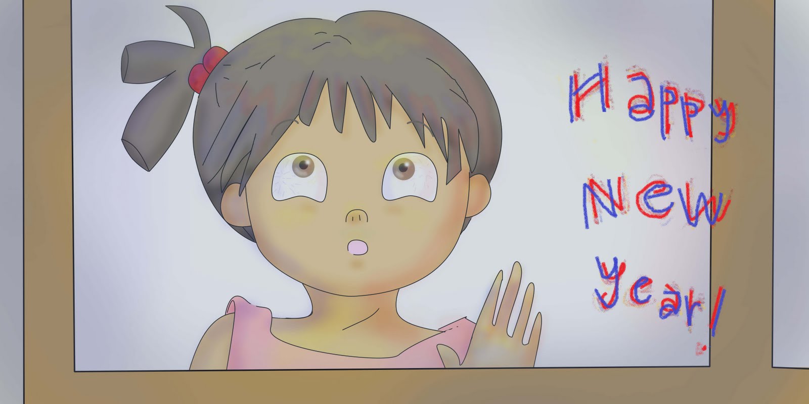
Midterms - Global Christmas
The fail-iest fail in the history of fails. :( I'm surprised I got an 80 for this. Made without a draft or any sense of using an oil pastel. How sad. Really sad. the people (can anyone even see them?) look like souls... that's the only thing I like.

Updated version of the T-shirt I made. This one, I think, is better. :-) I'm really proud of it! :D That's a picture of me wearing it, by the way. I cropped it because...my face is a precious precious piece of privacy.

Fourth Plate - Space
So far, my favourite plate. But it got the worst grade... Hm... Oh well, I still think it's nice. I finally understood (a bit) on how to control the freakin' oil pastel. It has a nice fell, I think.
I have two more plates to go for our design principle class. The fifth is still with my professor, while the sixth is till in progress. :-9 I'll post them up here when I have time.

Fifth Plate -
We had to do a pattern that would repeat. I also challenged myself to put something in the negative. It was challenging, alright. I envisioned this plate to have, like, lots of people walking around. I wanted it to seem like a busy crowd. The people were supposed to be smaller than this so that they would appear many, but I got lazy. I coloured one of the men with a purple attire because I also wanted to give it a concept of individuality.

Sixth Plate - Optical Art
I'm pretty happy about this one :-). I initially planned to colour it in with blue and green, but I didn't have those colours... so i was stuck with a candy cane. It looks just about ready to eat, no? I also wanted it to seem like a goblet, or an auditorium with stairs and things... I feel like falling down on it.